Met Mkrtchyan
Passionate UX/UI Designer 🎨 | Crafting Impactful Digital Experiences for Global Brands

Passionate UX/UI Designer 🎨 | Crafting Impactful Digital Experiences for Global Brands
Client For:
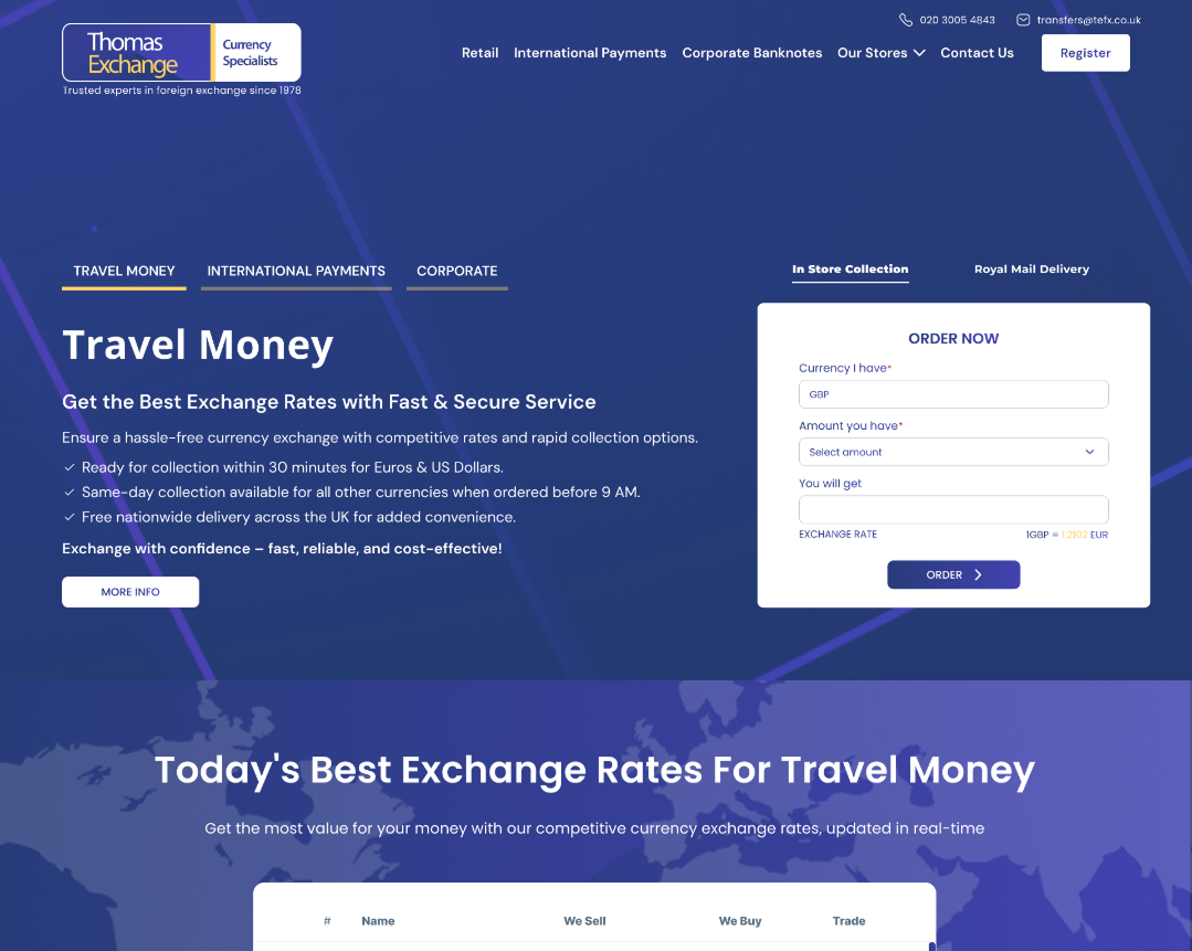
Thomas Exchange is a trusted and long-standing UK-based currency exchange provider with multiple branches across London. While the company had a loyal customer base, its digital platform had become outdated, making it difficult for users to access exchange rates, find nearby branches, or use core services efficiently, particularly on mobile devices.
I was brought on as the Lead UI/UX Designer to reimagine the digital experience from scratch. My goal was to deliver a visually clean, intuitive, and mobile-responsive platform that supports both walk-in customers and rate-savvy users planning international transactions.


Modernize the Brand Digitally
Transform a legacy-looking interface into a sleek, trustworthy financial platform that reflects the company’s reputation.
Improve User Flows
Simplify core tasks like checking exchange rates, calculating amounts, and locating nearby branches.
Create a Responsive System
Ensure seamless usability across devices — from desktops used in offices to mobile phones used by travelers.
Establish Design Scalability
Build a consistent, scalable UI system in Figma for future product enhancements or service expansion.
Redesigned Currency Calculator: Centralized and prominently featured on the homepage, with real-time rate toggling and visual clarity.
Branch Finder UX: Replaced clunky dropdowns with a modern store selector and intuitive interaction, making it faster to find nearby services.
Responsive Layout System: Developed flexible, pixel-precise grids and typography rules for six breakpoints, ensuring fluid usability on mobile, tablet, and desktop.
Visual Language Refresh: Introduced a clean, financial aesthetic with soft gradients, crisp edges, ample white space, and accessible color contrasts.
Micro-Interactions & UX Polish: Subtle hover states, visual feedback, and consistent button hierarchy improve usability without overwhelming users.
Led UX strategy, competitor analysis, and user journey mapping
Created low-fidelity wireframes and user flow diagrams
Designed a full UI system with reusable components and variants in Figma
Defined spacing, typography, color tokens, and responsive behavior
Handed off annotated UI files to developers and supported implemen